Devos & Lemmens - Packaging design
Combines both usability and distinctiveness.
Company introduction
Devos & Lemmens has been producing a wide range of different sauces since 1886. As a market leader in Belgium, they are know for their playful campagnes, and very qualitative products with a great heritage.
‘More sauces, more pleasure’
Product introduction
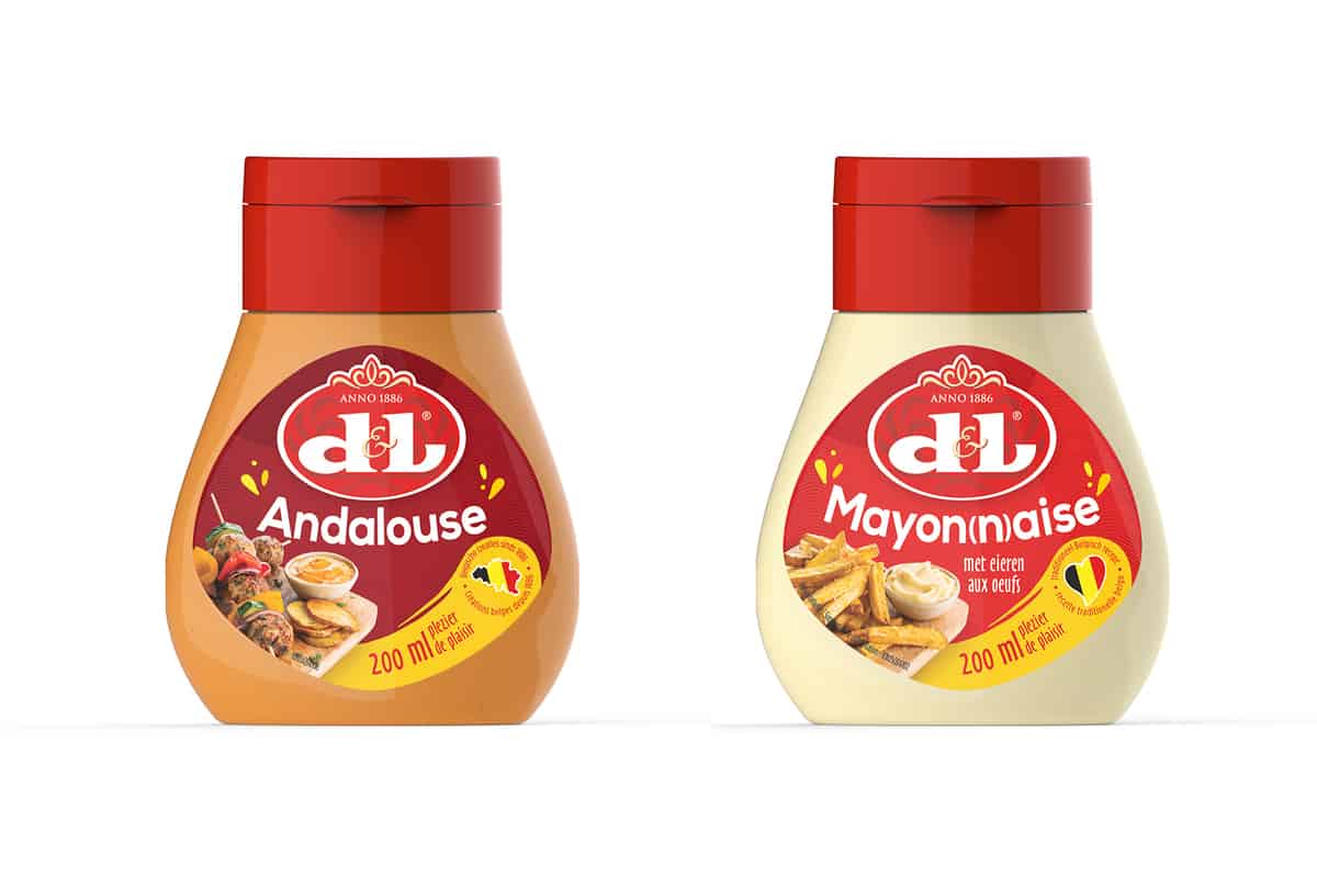
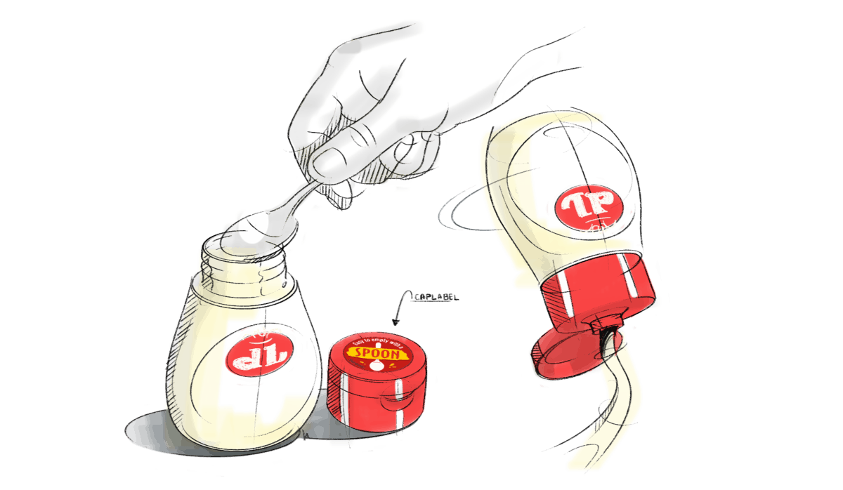
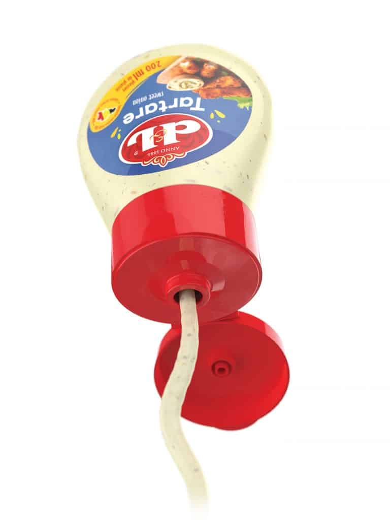
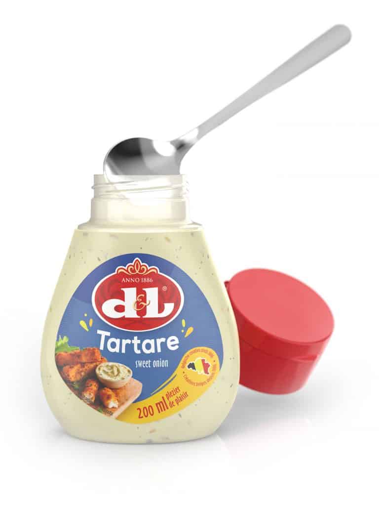
Devos & Lemmens had so far 2 pack types in the market for cold sauces and mayo/dressing. Jar & Squeeze. Squeeze was introduced in the market by Devos & Lemmens in 2008. This was a real novelty in the market. This introduction has led to market value growth due to higher price positioning for this new pack version and increased shelf space for D&L. In the meantime, all players have introduced squeeze as well and Devos & Lemmens has now no point of difference any more versus other players. The result of an extensive design process is a small packaging with a dual jar-squeeze function.
Create
Initially a workshop/brainstorm was organised together with the D&L team, GBO Innovation makers and some other creative partners to come up with inventive sauce solutions. Different ideas were validated with consumers in a qualitative research and GBO Innovation makers translated the best rated idea to a final concept design.
Realise
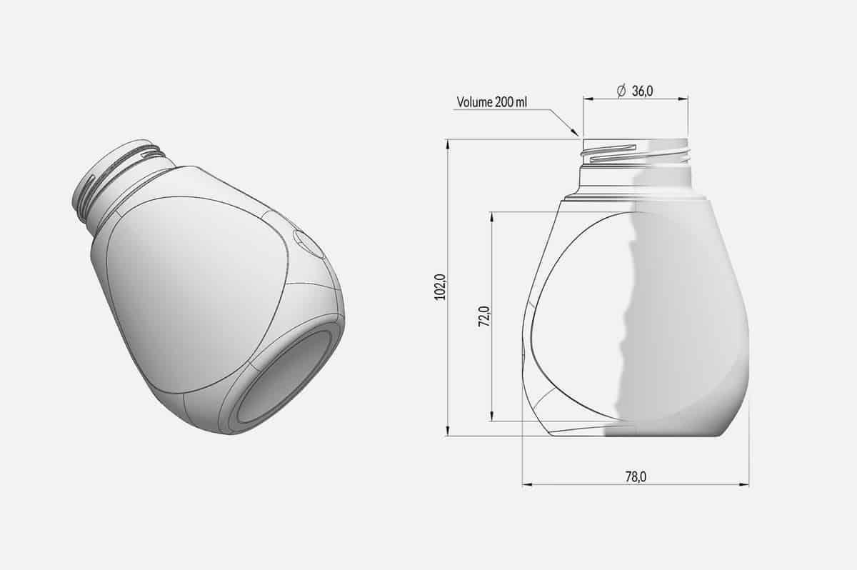
Together with production partners and the technical team from Continental Foods, The concept is translated to a producible 3D design, ready to be implemented on the production line of Devos & Lemmens.
Label design
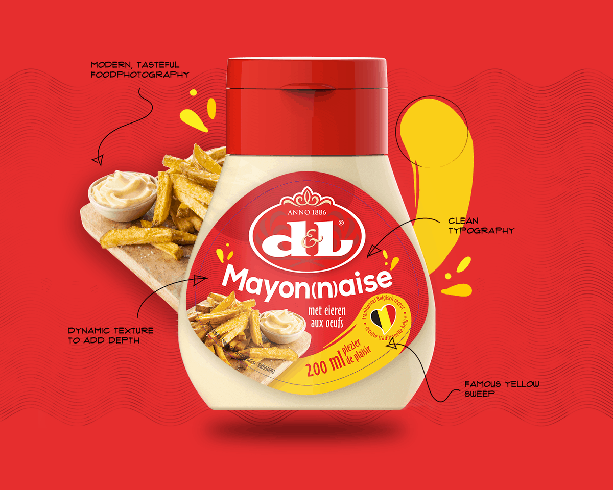
To introduce a new generation of packaging to the sauce market, it was also the ideal opportunity to give the label a younger, qualitative visual appearance. The label kept its familiar D&L language, yet with certain elements following current trends, making it more contemporary.
Questions?
Don’t hesitate to ask them. Also, have a look at a similar case in the FMCG sector.